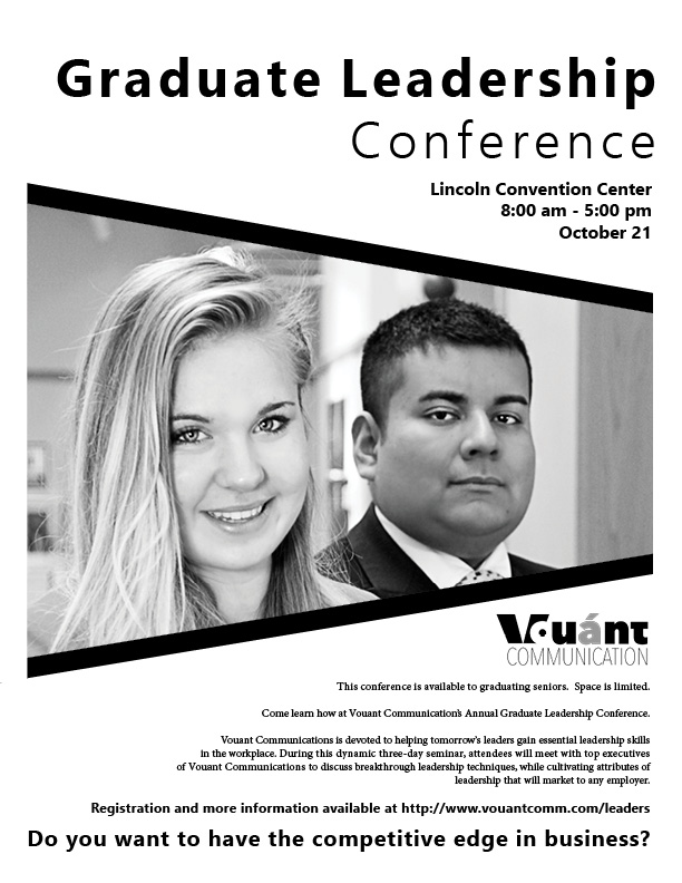
Description: Black and White flier advertising an upcoming Leadership Conference for graduating seniors.
Process (Programs, Tools, Skills, FOCUS principles): After reading through the material given, I sketched several ideas out on paper. When I found the design I liked the best, I used it as a guide in Adobe Indesign. I created a focal point on the photo by enlarging it and framing it with diagonal black lines to contrast and balance the rest of the flier. The repeating diagonal lines of the photo and the slanted word alignment creates a good flow for the reader to find the important information. I used a large font for the title and subtitles to add emphasis and used small body text for the rest of the information. I was given the text, logo, and photo to use in this flier.
Message: I wanted to create a professional feel to this flier to attract the attention of graduates looking for a leadership position.
Audience: College seniors who will be graduating soon. Men and Women ages 25-35.
Top Thing Learned: I learned to respect white space, and treat it as I would any other shape or element on the page.
Title Font Name & Category: Nirmala, Sans Serif
Copy Font Name & Category: Minion Pro, Oldstyle
Links to images used in this project:

Really love your flyer! I like how you framed the faces of the people in the photograph using those diagonal lines. Really good use of alignment too by right aligning your text and following the lines of the photo area. I also like the font you used for your title area. It’s really clean and professional looking.
Here’s a link to my flyer if you want to check it out: http://comm130.elethompson.com/project-1-flyer/
LikeLike
Janae all I have to say is wow! I felt out of all the fliers I viewed your’s popped out at me the most! I love the close up angled photo of the subjects. I like how it slopes and starts smaller where the person in the background is smaller and then gets bigger towards the woman in front who is closer to the camera. I like your use of contrasting fonts as well.
Here is a link to James’ flier:
https://jchellblog.wordpress.com/2016/01/22/project-1-flier-2/
LikeLike
The gestalt is amazing, The lines creating anothers shapes is my favorite part. The information in the bottom is a little bit squizzed, maybe yo could make bigger the typefaces.
I love it so much 😀
Please, Consider to write a comment in my blog. Hugs.
HUGS
http:// comm130.velartec.com
LikeLike